Editing 2 – Blends & Type
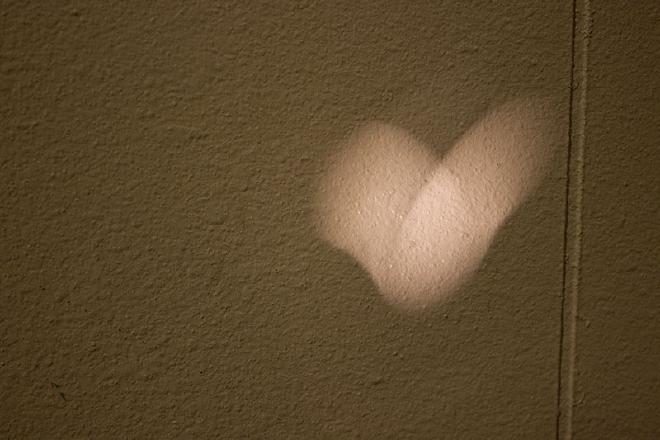
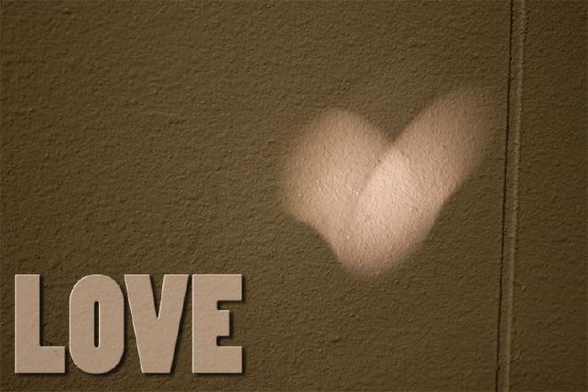
This one wasn’t really hard to make. I morphed a copy of the background and the type layer together, added some bevel and a drop shadow to the type, and then took one of the colors from the center of the light heart and blended that color in a little bit to the type layer. It’s a subtle effect, but I didn’t want to go overboard on this; I think the image mostly speaks for itself.
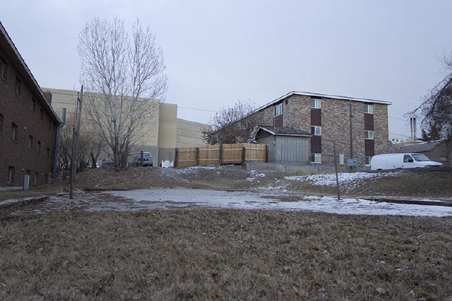
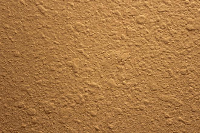
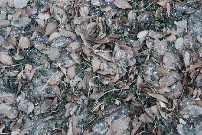
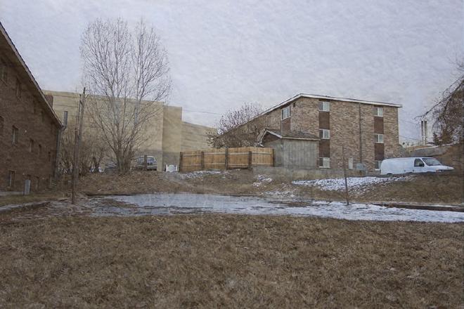
This blend is a composite of all three of the above images. The main image is, of course, at full opacity. The others are both around 20-30%. Then I used masks to lighten some parts even further, particularly in the sky and on the court. I really wanted to use the leaf texture because it was actually taken on the volleyball court. But I also really like the texture and the coloring that the wall texture added. I think it made the image seem less sterile.